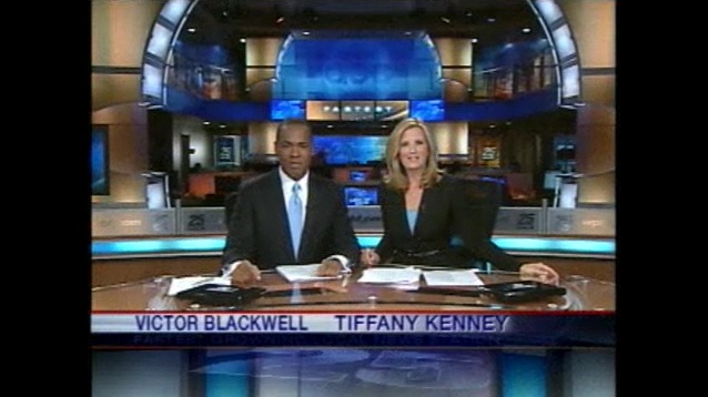
There it is, WPBF’s new set. Made its debut today at 4pm.
I think it looks sharp and very nice looking from what little I was able to see online so far. Good decision to keep the 2-story newsplex look and not going for the corporate set seen at WCVB and other stations.
Unfortunately it appears WPBF hasn’t switched to high definition.
We’ll have more screenshots and video soon
Eh, I had a premonition about WPBF not being in HD yet. Oh well. I was so close.
But, as I said on the post mainly about the logo (which isn’t really the best), the new graphics and set are quite good.
It’s better than WPLGs upgrade. Their look and everything was more or less the same. Totally overhyped. WPBF didnt overhype this, they did it just right! I am totally sold on this underdog and will probably watch them now as long as i am in West Palm Beach. their new logo was suppose to be a bit reminiscent of their original, which it is, colors and everything. I would rather a upgrade like this than HD and the same look. Im sure HD isnt far behind tho.
I know, shame on Hearst for doing this to this station!!! But for WPBF, good job!
that is a kick ass set..
Wow! I’m impressed. This is way better than I expected. I figured they’d end up with something like WESH’s set, which seems pretty small and doesn’t take advantage of the newsroom. But this is nice. Well done! I look forward to seeing more. The logo, however, isn’t impressive at all.
Sure, they’ve got a new set, but it’s still in fuzzy SD. Sort of like giving your car a new paint job, but using a paintbrush instead of a spray. What’s the point?
I prefer the older set.