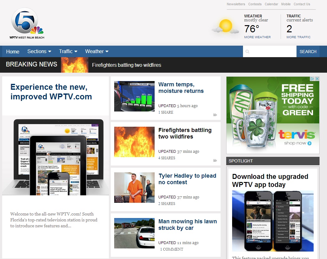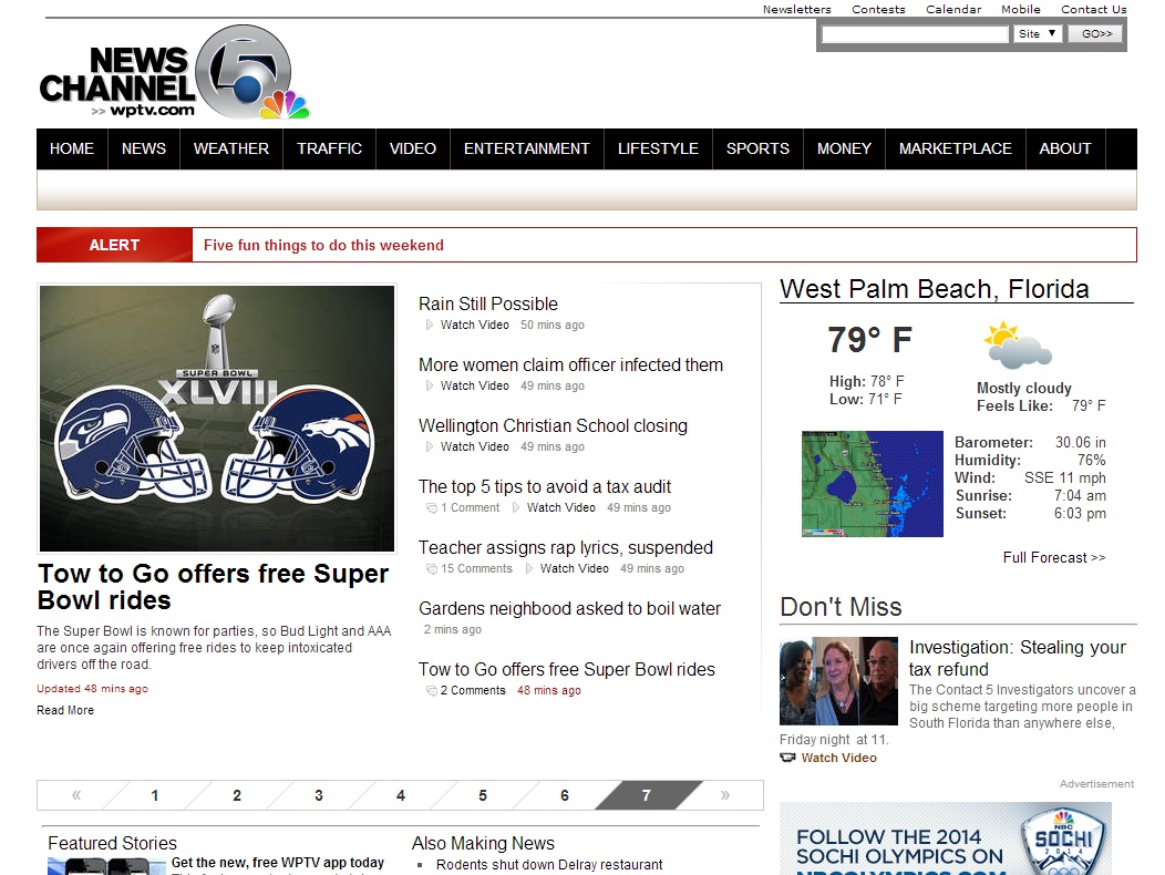
 Scripps-owned Palm Beach NBC affiliate WPTV just went live with their new website, and less-is-a-lot-more seems to be what they thought visitors would like best. And we (I) love it!.
Content on the new WPTV.com is still wrapped in a lot of white just like before, but the overall feel and look of the site has been simplified. Gone are the columns of tiny links that forced you to stare at the screen to make sure you’re clicking where you want to. Now, the top stories along with the rest of the headlines, are featured more prominently – in big rectangles with bold headlines, which those of us on high-resolution devices can appreciate as it makes the headlines easy to glance or read.
The redesigned and simplified header section adds to the overall de-cluttered feel of WPTV.com with just the station logo on one side, and weather and traffic on the other. The navigation bar has been reduced to just four links – home page, weather, traffic, and sections which neatly hides the different sections of the site. Previously, the navigation bar was a big, black strip that linked to every section of the site no matter how minute.
My most favorite part of the new look has to be how clean they kept the story pages! There’s only the bare minimum – a large video player sitting above the story with sharp crystal clear video, the story text itself without any ads breaking the flow, and a right sidebar with trending and featured stories plus two box ads. No flabby bellies, or wrinkled ladies wearing a lot of make up staring you in the face as you read a story!
The new WPTV.com was also built to be responsive – a term used to describe a web design technique that adapts a website’s design automatically regardless of the device it’s viewed on. And on a small screen like a smartphone, reading WPTV.com is a breeze. You get all the top stories right up top, and the larger, bolder headlines carry over automatically.
I have to say, I’m a huge fan of what Scripps has done. The cost of online ads doesn’t come close to what TV stations charge for air time, and some (most?) stations compensate by cramming ads on their pages with as many links as possible to get people to click on page after page to generate page views. WFOR and the CBS-owned station sites for example have 10-12 ads on their story pages. We’re glad to see Scripps chose to go down a different road.
With all that said, to us the new WPTV.com is easily the best local TV station website right now.
[WPTV.com]
I agree! I love it! A fantastic redesign