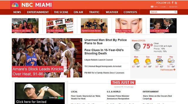
A new and very bright orange/red NBCMiami.com has gone live. The site’s header, footer and the front page seem to be the only elements that have been redesigned. The story and category pages have retained the previous look. playing off the ‘big white letters in a rectangle theme NBC is picking for its stations’ on air graphics.
Overall the theme of the new design plays off the ‘big white letters in a rectangle’ theme that will also be seen on the air.
NBCMiami and NBCDfw are the only two stations that have the orange/red color theme. The rest of the NBC affiliates have been given blue/purple color schemes except NBC in San Francisco which has some weird green/turquoise color instead

Next we’ll be hearing that NBC’s local stations have all adopted the “more colorful.” slogan (assuming it’s not changed for next season), as it looks inspired by the national NBC graphics package. Personally I think it looks better than the crap they had before, with that awful font used for local branding.
Station branding will probably be next, though to be honest I think NBC should take the route of Fox and leave most of its stations branded on-air as NBC4, NBC6, etc. (stations like KNSD-39, though, are probably different because they are on the UHF band and therefore a rather unpleasing channel number for a Big Three network; in contrast, many of Fox’s charter O&Os are on UHF and are left alone with the exception of WFLD in Chicago) and have their websites reflect the community they serve: NBCNewYork.com, NBCMiami.com, etc. I think this will work.
Not trying to rant, however descriptions like these tend to get long-winded when you’re trying to explain yourself.
nbcla.com has a different color. It blue and light blue not purple just like nbcsandiego.com it just hard to see the difference if you look fast.