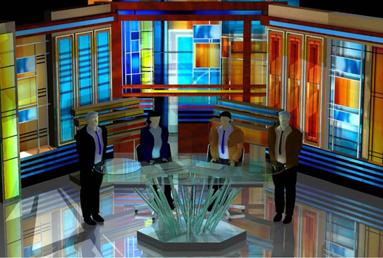
The above is an artists rendering of the new WPLG studio. Remind you of anything? Feels a tad like a church if you ask me. If the final installation matches the renders, it is certainly going to be the most… colorful… set in South Florida. My problem is it seems too bright. I’m not sure how I feel about waking up at 5a.m. to that.
Another photo after the jump:

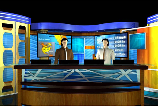
This will be the new weather center, I’m guessing. With the new studio, will also come Local 10 HD. Construction on the new facility is expected to be finished sometime in 2009. IMO, it seems a little small (from what I’ve seen so far). What happened to go big or go home, and what about an interview area? Then again, I’m used to the mammoth studio that NBC6 calls home. More info soon.
~Thanks to NewsBlues, and NewsCast Studio Blog!
Not bad but a little weak for something that will premier in 2009 or ’10. I expected more but again its not bad, I actually think its nice, the anchors look a little stiff but they’ll relax once they get used to it.
meh…i guess the slumping economy is forcing them to think small…
also, i think the renderings may just be poorly-drawn…i’m sure it will look stunning in HD. or is that wishful thinking?
I think it’s a little of both 😉
Also, after looking at it a little more, it looks kinda like a game show set or a talk show set. lol
and what’s with that anchor desk?? looks like superman’s cave/home thing made of crystals…
Looks like the Jeapordy Set. By the way admin – I like the new look of the site! But it doesn’t show who is making the posts, you or Alex?
the new look was due to the site breaking down. thanks for letting me know, I didn’t notice that. i’ll pass it on to admin. thanks!
The new set is going to be way too colourful. It does look like a church. The weather set could actually make a nicer news set. But I would love to see them incorporate everything like WTVJ. I dont like the idea of one thing being in one corner and the other in another corner. I like how WTVJ’s sets allow for smoother and more direct links.
It’s just an artist’s rendetion. If you want to see what the set will look like, just watch ESPN. Very oolorful and very good.
that would be “rendition”
I couldn’t help but notice the similarity in feel to the “Jeopardy!” set. Clearly I was not alone. If I had a beautiful, talented anchor like Laurie Jennings, I would want my audience’s attention focused on her, and not the aurora borealis exploding over her shoulder. What happened to the new wave of virtual sets? Jeez, do it in front of a 20ft. tall green screen. Who’s designing these sets, Bill Kamal?
WPLG isn’t going to put a cheap looking, crappy set into their new 30 million plus dollar building. Come on. The set is going to knock your socks off. Colors, monitors. Very sportscenter
So when are they going to fire it up? Is March still the target, or are they behind?
I guess WPLG wanted to go a little bit over-the-top with the new HD set design. Just my opinion.
I don’t know, it does look interesting and different.
At least they didn’t go with that tired and rehashed stuff every other station in the country is doing