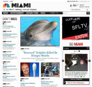
Late tonight (last night for you, by the time you read this) NBC, for all intents and purposes pretty much re-booted all NBC[YourCityName].com websites, NBCMiami.com included of course.

The redesign is a small part of the overall change of the site. There’s a new feature that as NBC puts it aims to “capture the pulse of Miami”. More on that after the jump
As before the site is very detached from the TV station. In fact you’d be hard pressed to find anything about or from WTVJ on the front page, unless you look really really really hard … as in bottom of the front page hard.
And right now is it just me or is the whole front page nothing but fluff stories? Save for the ‘Miami Devoid of Volunteers’ story.
New Logo
The new logo features only the peacock and the city name. The old logo which had the city abbreviated to MIA

The tag line under the logo is dynamically generated. I’m guessing changes based on what the top story is. Right now the top story is about a dolphin that got eaten by hungry sharks and the tag line reads ‘Is sad about releasing rescued dolphins’. More on that below
New Layout
Gone is that icky thumbnail navigation (that never really worked as intended anyway) in favor of a 3-column scroll down design with the major headline in the middle column and the most recent stories below it.
Navigation Bar
The navigation is still at the top though made larger and simplified. The only categories listed are now are News, Entertainment, Around Town, Video and Miami Is… The weather and traffic pages have been taken out of the navigation bar and added to top right of the header opposite the logo.
Video
There is a video section but there isn’t any video from WTVJ. In fact the video page’s featured video is from some website about supermodels and fashion.
Capturing the Pulse of Miami
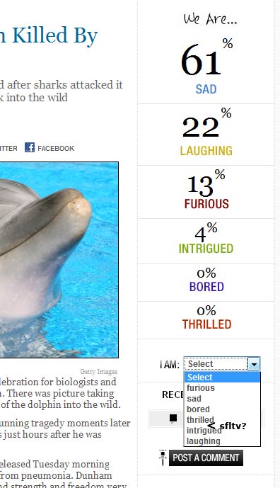
To the right of every story is a column titled ‘We Are…’ where the ‘mood’ about the story is shown as percentage of votes, similar to a web poll.
A reader can click on a drop down menu in the ‘We Are…’ column and choose from several ‘moods’ – furious, sad, bored, thrilled, intrigued, laughing. Anyone can vote their ‘mood’ without the need to register.
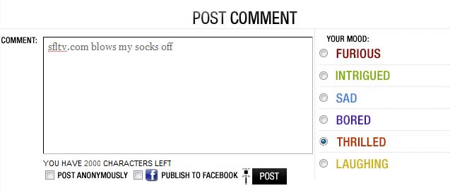
Readers wishing to leave a comment about the story can also express their ‘moods’ there.

My thinking is that the tag line under the logo is auto generated based on how readers on the site are voting on stories or on top story.
Visitors can share their mood about stories, videos or picture slideshows
Miami Is…
Under the ‘Miami Is…’ section of NBCMiami, visitors can see what “Miami is… Emotional about” for example. Or pick from the drop down menu and see which stories made readers furious. Visitors can sort the stories by mood intense, most viewed or most commented.
So Miami
That twitter-like feature that was being tested on NBCMiami recently called ‘So Miami’ is now fully baked and plastered prominently on the front page letting everyone see and read other people’s “moments” and inviting readers to share their own.
Overall the design is very clean and without clutter and distractions that are typical for other television news sites. The content seems very softball though and the site, at least on my computer feels a little heavy, making Firefox a bit sluggish.
What do you think? Has NBCMiami Improved or has it gotten even more soft and gimmicky?

Just one more website with nothing of real interest, and no connection to the TV station. What’s the point?
where are the anchor/reporter bios!?
who cares! I like it!
A local station website without weather….in Florida….south Florida!? WTF!?
It might not be obvious but clicking on the weather icon on the top right takes you to the weather page. I’m seeing more and more sites do that (see sun-sentinel.com, works the same way). Either user are becoming more knowledgeable about where to click or web designers are assuming too much.
Overall it’s better then the previous site but still pretty lame. I want local news/weather/sports not fluff pieces or national news, which is still 90% of the site. Sorry NBC but when the first thing I see is a picture comparing Dr. Phil to a Q-tip, I’m out of there.
Its actualy a nice website, just wish it didnt have to come in for WTVJ. Don’t like the fact that a news channel is using this softball website. If it was an independent news website for recreationalal use, networking, social site, and really fluff stories.
It’s a different approach. If everyone else hates WTVJs on air choices, why are you seeking for them to have a nice website? I would have thought everyone else here would have moved on to other channels by now.
It’s all entertainment crap…where’s the news? I see no purpose for this site. They should have the station site and this site seperate for entertainment and opinion crap….waste of time.
It’s pretty website, but they show poor taste in handling of some stories (Horse Becomes Mr. Dead), and when comments are critical of that poor taste, they are deleted.
No, I don’t think I’ll spend much time at a website that censors comments in that manner.
The new NBCMiami is a failure.
I love the featured video on the website about chopper 6 in HD!