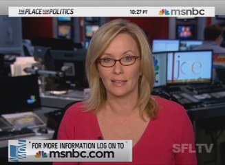
Caught a glimplse on MSNBC of their new graphics. They’ve been testing them all day on Sunday before the official launch on Monday (June 29,2009) which is also when they’ll be broadcasting in high definition.
They’ve gone the opposite direction of bold, flashy and loud. The colors are a bit sterile using a faded silver/gray as the base. The lower thirds are the same shape as CNN’s and (I think) using the same technology. They’ve replaced the time bug with a long bar at the top of the screen showing the channel slogan, time and rather big logo. Not sure I’m too crazy about it
After the jump a video from the 10:30pm east coast time news update:
Love it.
It’s a nice change, to differ from the others. I’d like to see what they’ve done to Countdown.
must of been a slow news day!
I’m not sure if I like this new layout. It almost reminds me of a web browser or other computer screen…in fact, more than anything, it seems inspired by the Mac OS menu bar, except that the Apple logo (or, in this case, the MSNBC logo) is on the top right corner of the screen instead of the top left. It just seems so weird to me…