Some of us got a little too excited with Univision’s teasers.
Yesterday they debuted a fabulous new set but sadly no high definition. Yet anyways.
They posted some nice photos from the unveil on Univision23.com
And my DVR cooperated so I was able to record the 11pm newscast and take a bunch of screenshots
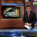
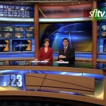

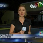
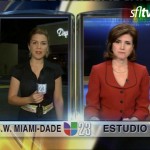
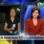
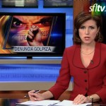


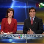
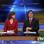
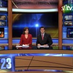
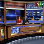
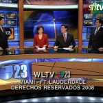
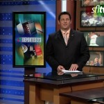
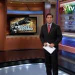

The layout looks a lot like the Telemundo 51 set but with plenty of plywood. The logo on the front of the desk and the wood slab next to it looks blah.
Assuming the piece behind the anchors is a monitor and not static, that set is way nicer than any of the English-language stations’. I agree it does have a similar feel to 51’s.
Wow you should see the Univision news station up here in Boston, it looks like it’s being produced out of my basement. The set is so ugly.
As a new incorporation to WLTV ( a little more than 2 years ), I did not feel as tired as some others, colleagues and viewers, with the now gone old set.
As you might also imagining, this new set has brought a big expectation and also comfort to our News operation.
You should see how big is the every minute brainstorming, among all us, in order to improve, to incorporate, to erase, to fix, to make things better; camera, delivery and tech-wise.
It will happen sooner than expected.
Maybe the blue-ish color reminds you our Miramar competitor’s set. But it also carries a different vibe, technique, style, colors, backgrounds.
It’s fair to say than in TV, you either go red or blue ( CNN or Fox, to refer to ). Steel ( we are not an italian club ) mahogany ( neither an attorney’s office ) or green ( nor a enviromental documentary ) are not a way of going with design.
So, sticking to blue-red standard, you can be sure we are and will improve our quality.
Sweeps are two days away, we hope to kick some….some good
luck !!
Enrique Teutelo, 11 pm Anchor, Channel 23 Univision Miami.
Wow! That set looks like it belongs on the national newscast, definetly the best in South Florida, WSVN is a personal favprite but this Univision set is great. WFOR and NBC could use some re-touches or upgrades heck a totally new set would be great. WPLG I know is getting a new set in their new studios, it better be an incredible one since it will probaly be the most modern one in SoFlo. WSVN is great just because it has the Newsplex (that so much envy and try to copy) but it too can use some work.
Congratulations to Univision-23 and to an outstanding journalist, Enrique Teutelo. Thank you for taking time out of your busy schedule and commenting on your news department’s new “vibe.”
The new set is outstanding, yet I would of liked to see an improved area for the station’s much-hyped weather system, radavision. Perhaps the station could of made a weather area, like Telemundo 51 and NBC-6 have. I guess they’ll stick with Radavision’s HQ in the 23 newsroom. If you’ve been to the 23 news studio, you’ll notice they are pressed in the same studio with their news-set, and the network’s entertainment-gossip show, El Gordo y la Flaca, and next to them the Sabado Gigante studio.
Also, if you’ve been watching Univision-23’s newscast you’ll see they have done away with the corner-insert graphic, since now they’re plugging the graphics on the flat-panel screens behind the anchors. WFOR-4 should do the same since their anchors’ backs are to the flat-panel screens too. Which brings me to a great point: Telemundo-51 and Univision-23 now have a large projection screen behind the anchor desk. Why not use that screen to show a shot of the sun rising in the beach for both station’s newscasts? Why not show a picture of the Miami skyline with the sun-setting behind the skyscrapers of Downtown for the six-o-clock show? Why not show a beautiful shot of Moon over Miami, downtown cityscape at night? WFOR has smaller flat-panels and they use it beautifully. Perhaps 51 and 23 should do the same. I remember Telemundo-51 used once a nice Decision 2008 backdrop for an election night, but since then they have gone back to the boring shot of a control-room. Channel 51 and 23, please use nice shots of Miami behind your anchors instead of a boring univision blue logo or a busy control room. Heck, I’m from Hialeah, use a shot of the new Hialeah gate crossing at Okeechobee and East 4 ave.
Nonetheless, congrats to the set design team!